



Saristi – Cuore e mente
Beverages, Herbal & Teas
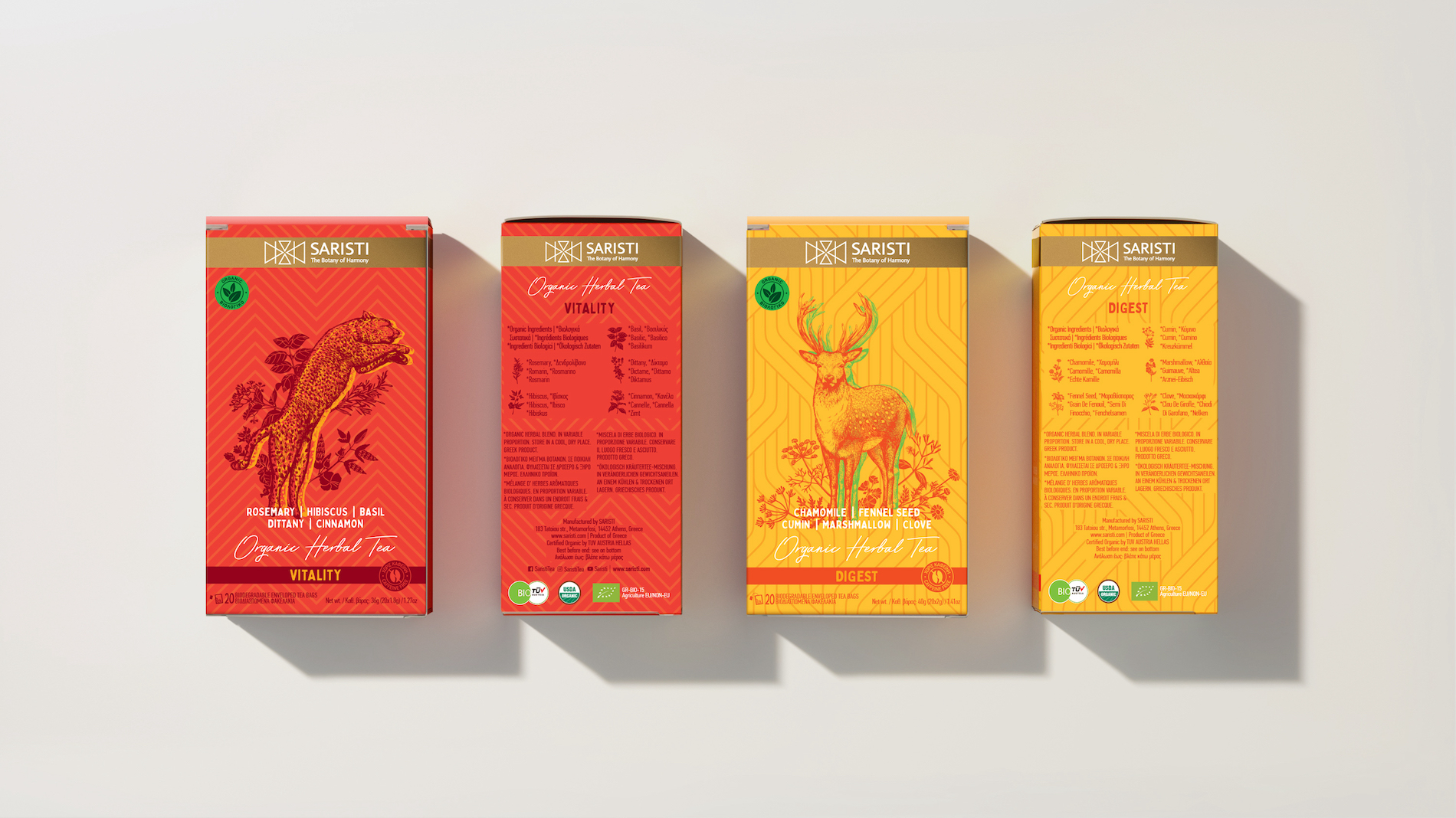
Following the road of Hippocrates, Saristi gathers roots, leaves, flowers and herbs and makes drinks that heal. From Greece, the East, the four corners of the world, selected natural herbs combine their bioenergy and offer physical and spiritual harmony.
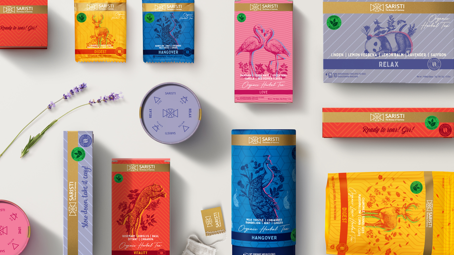
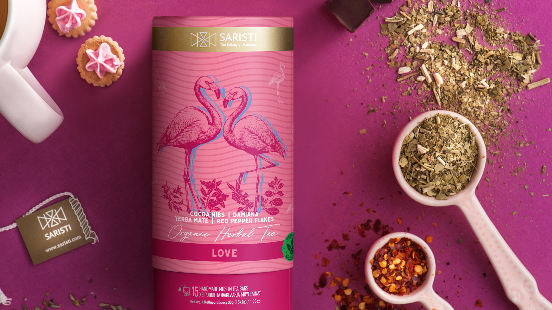
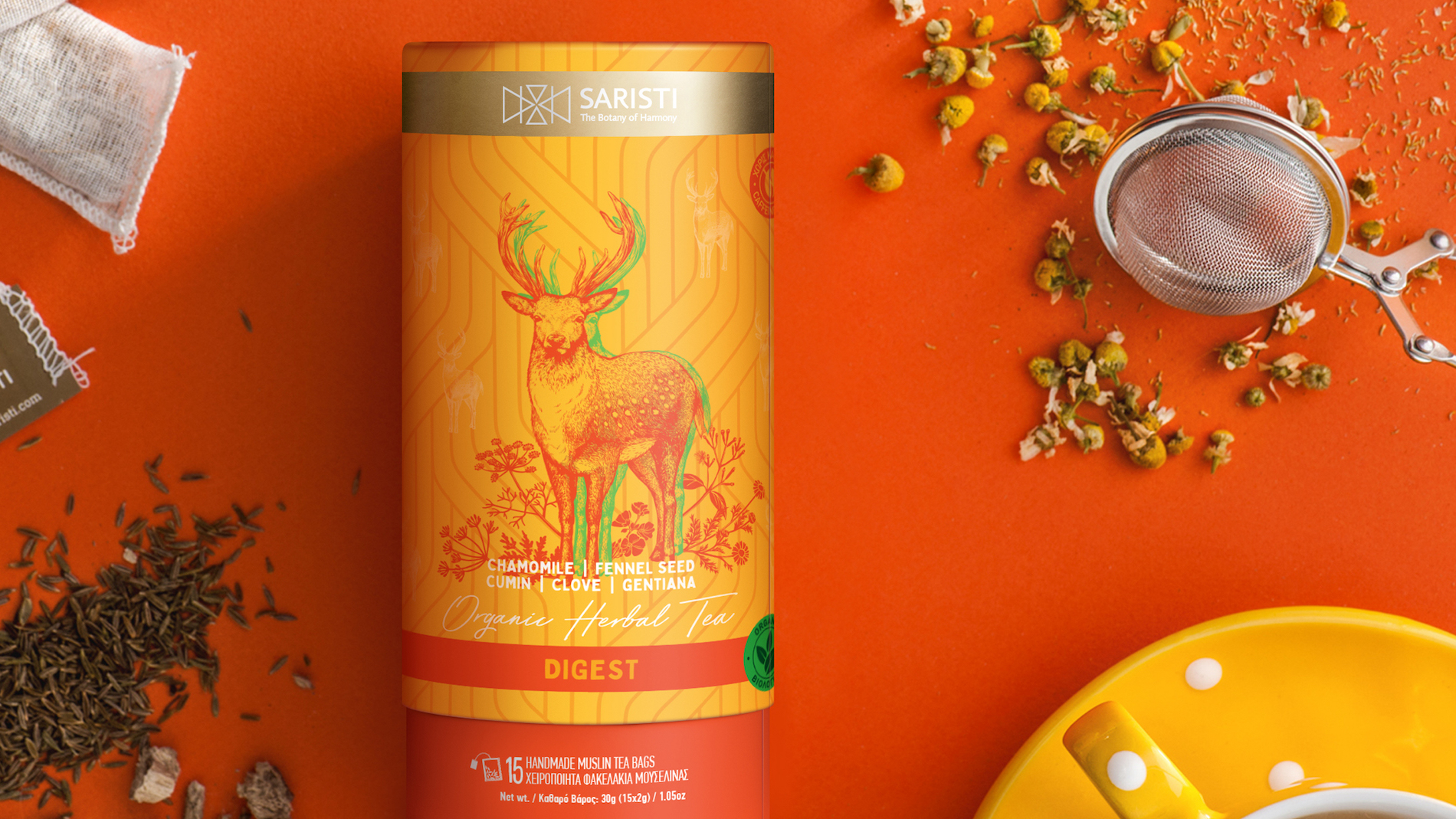
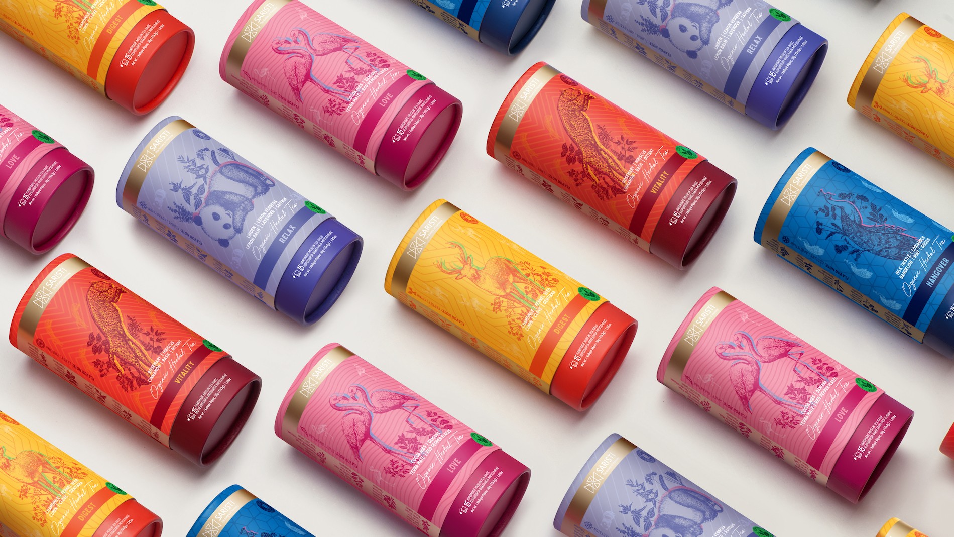
The guide to Saristi’s identity was the philosophy of the brand itself. We delved into the deeper essence of natural treatment, the principles of balance, the four elements of nature: Earth, the matter of existence. Fire, the power of metamorphosis. Water, the power of transport. Air, the principle of movement. Their symbols merged and created the logo, which is the fifth element: Ether. The logo is the synergy of all elements that, when they exist inside us, they help us achieve true harmony in our spiritual core.
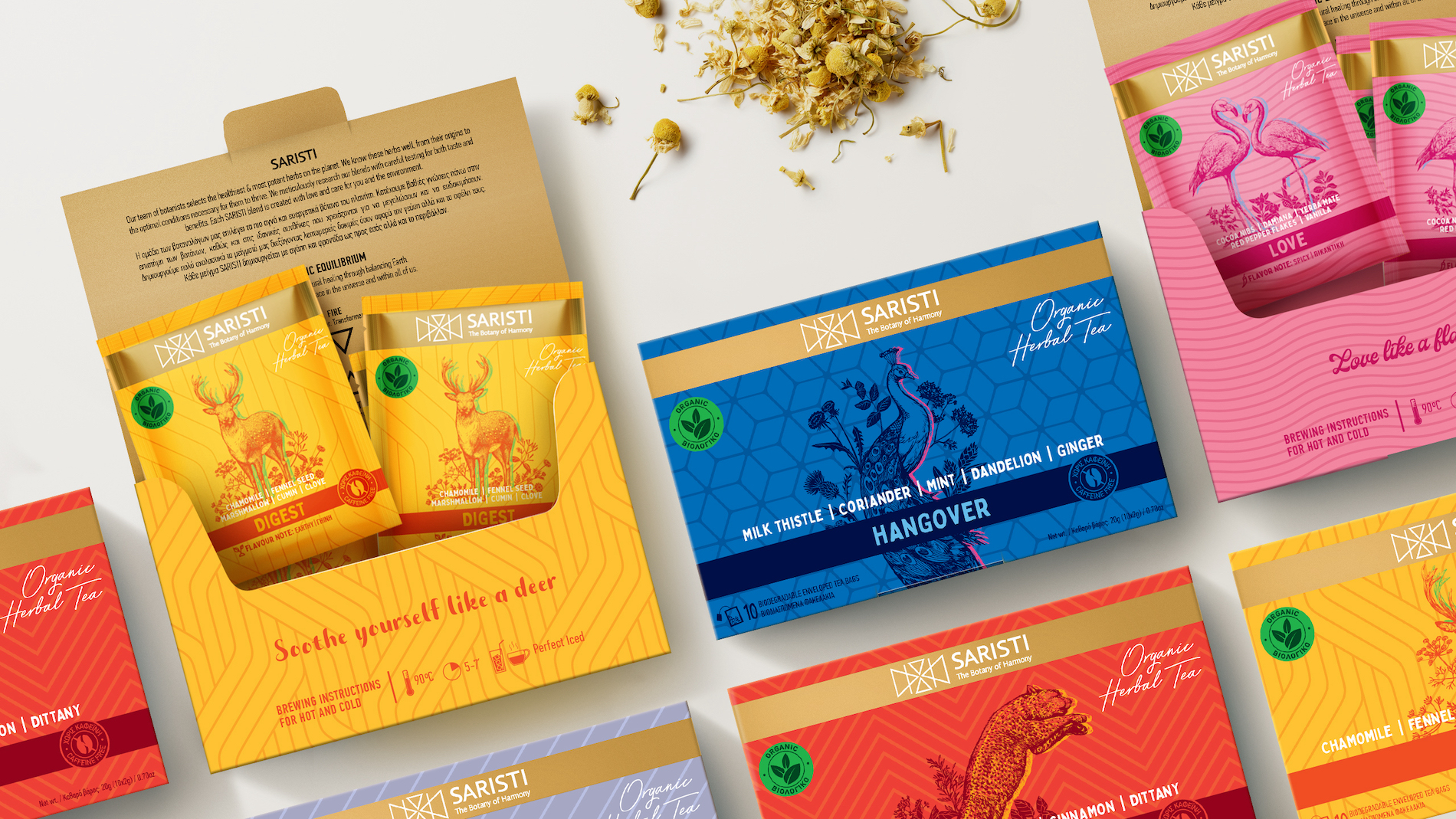
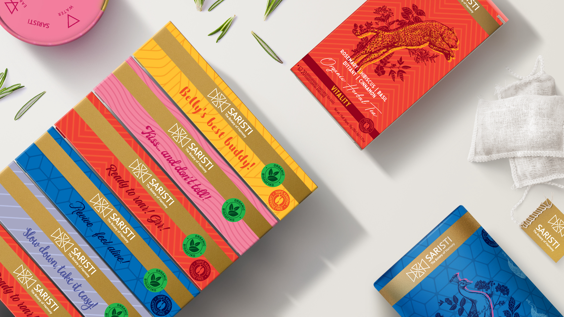
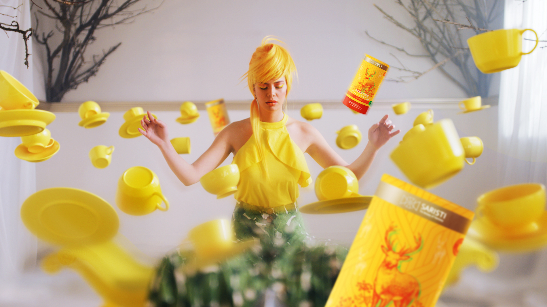
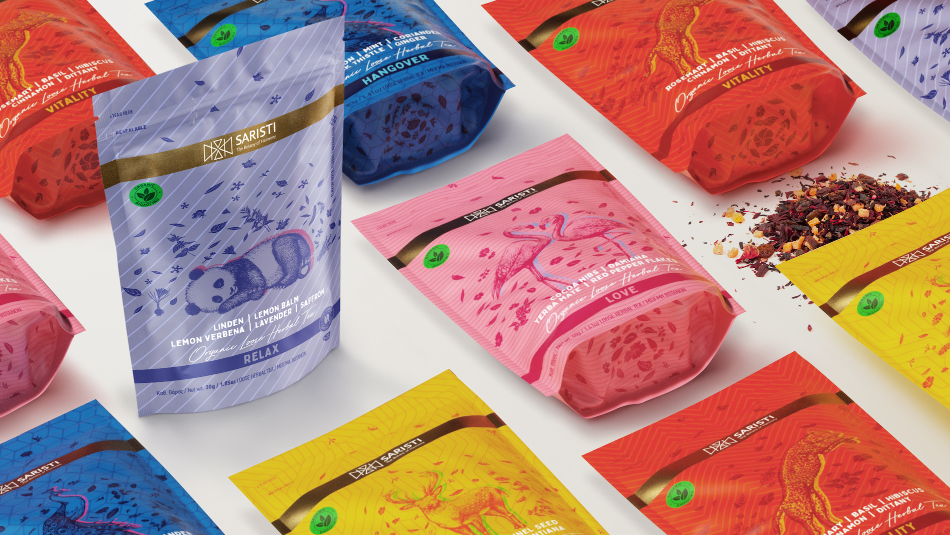
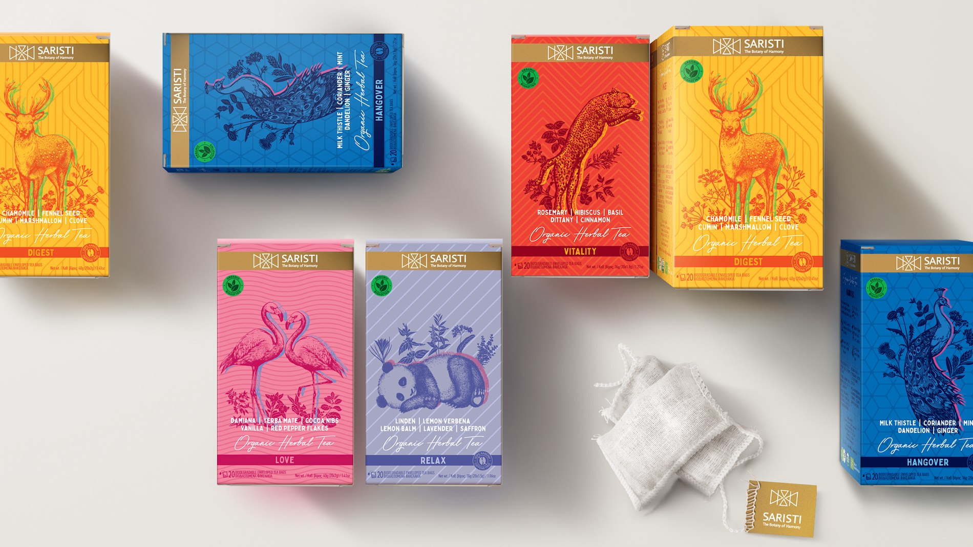
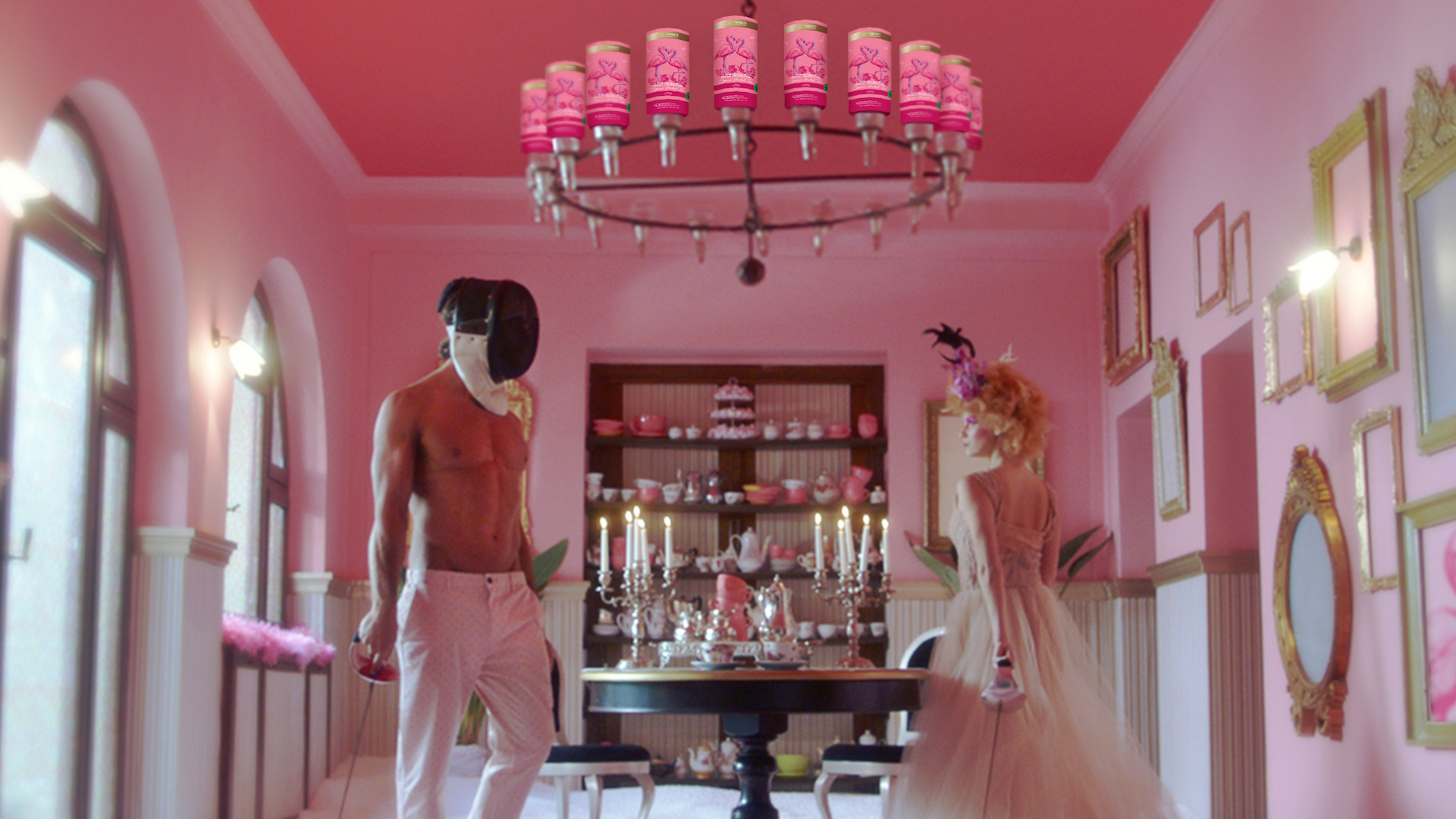
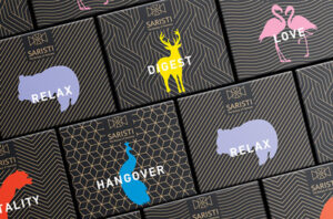
The semiology of the colours transports the operational characteristics of each drink, causing vibrations on the environment and on the portrayal of the animal. Each animal represents a cure. The leopard, the peacock, the panda, the deer, the flamingo become ambassadors of a philosophy which invites to the natural form of the world and to a contemporary and ancient way of life.
The brand’s design has been created for an audience that thinks our-of-the-box, as a small luxury for the true trendsetters.
Brand Architecture, Brand Definition, Brand Development, Brand Growth, Brand Guidelines, Brand Identity, Brand Story, Brand Strategy, Corporate Identity, Design Strategy, Illustration Language, Image Language, Naming & Nomeclature Systems, Packaging Design, Tagline & Brand Language, Tone of Voice, Typography, Visual Identity
Awards & Distinctions
| 2023 | Greek Label Awards | Silver | Promotional Packaging |
| 2022 | Packaging Awards | Gold | Structural Design Innovation |
| 2021 | Novum Awards | Gold | Packaging Design |
| 2018 | A’ design awards | Silver | Packaging Design |
| 2018 | Mobius | Certificate for Packaging Design | Food |