

Morosha Dzherelna
Beverages, Mineral Water
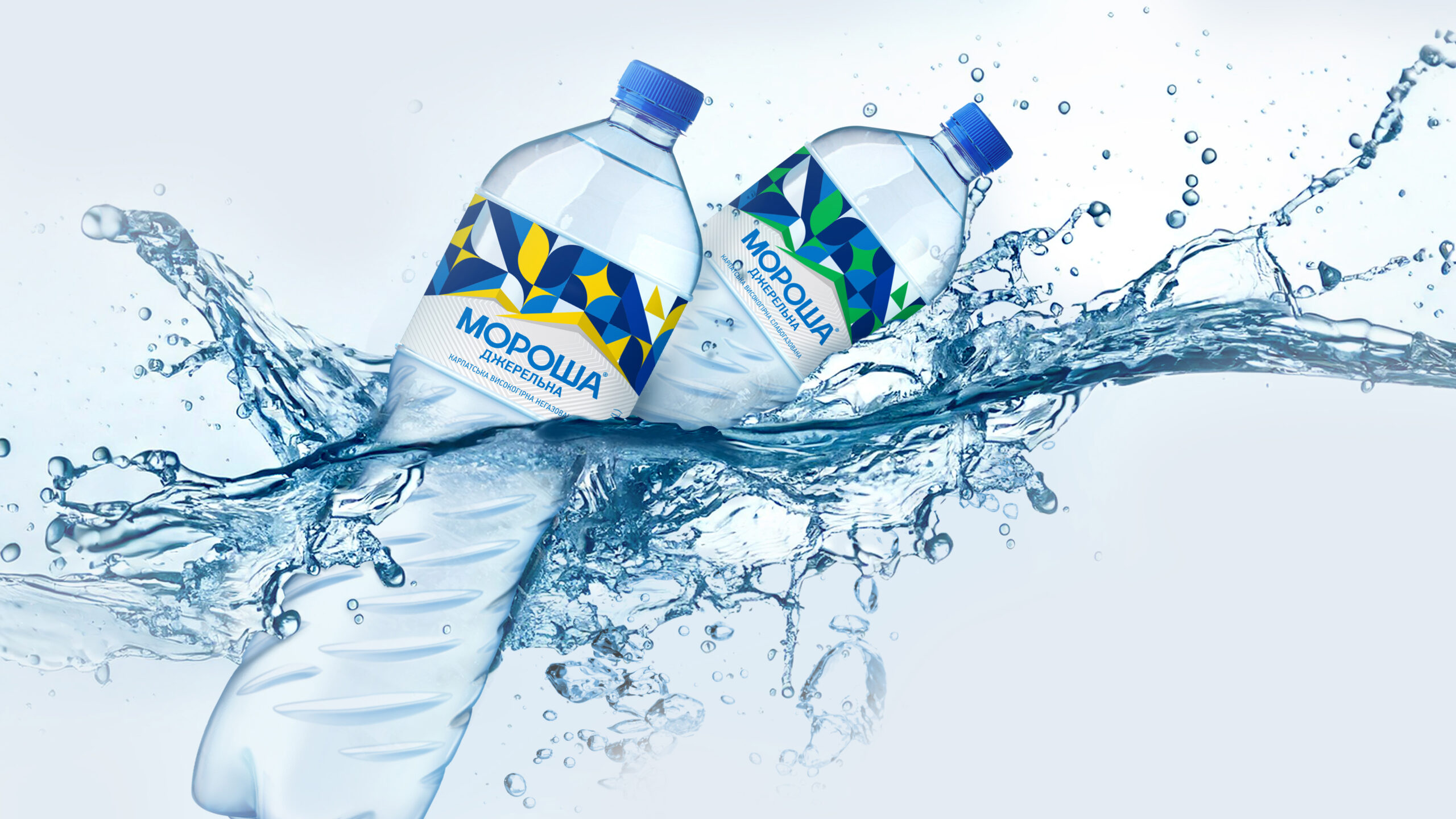
Launched amidst the trials of war, Morosha Dzherelna is a symbol of
resilience and renewal, embodying the courage and determination of a
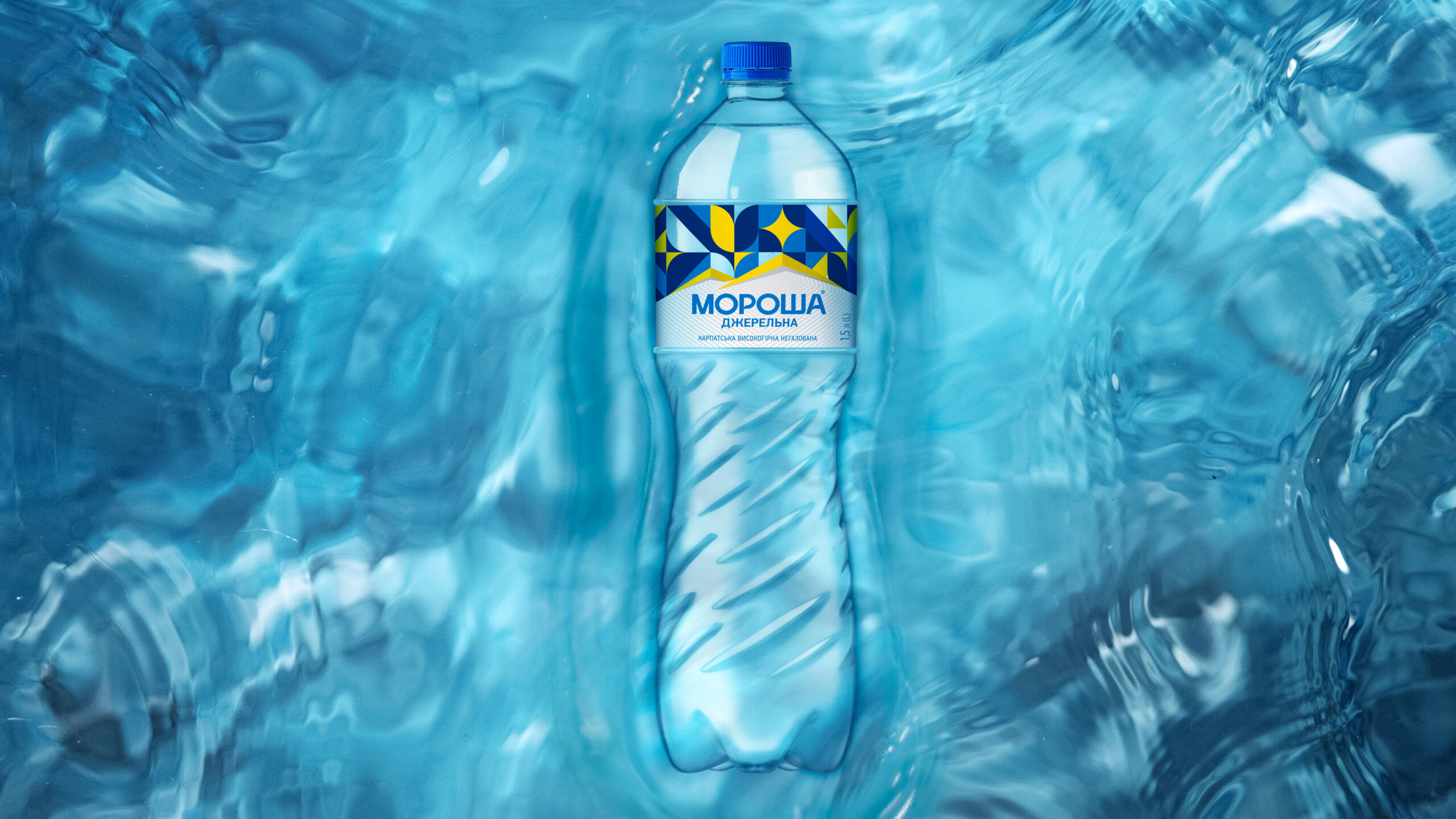
nation striving for a brighter tomorrow. Its design speaks to this
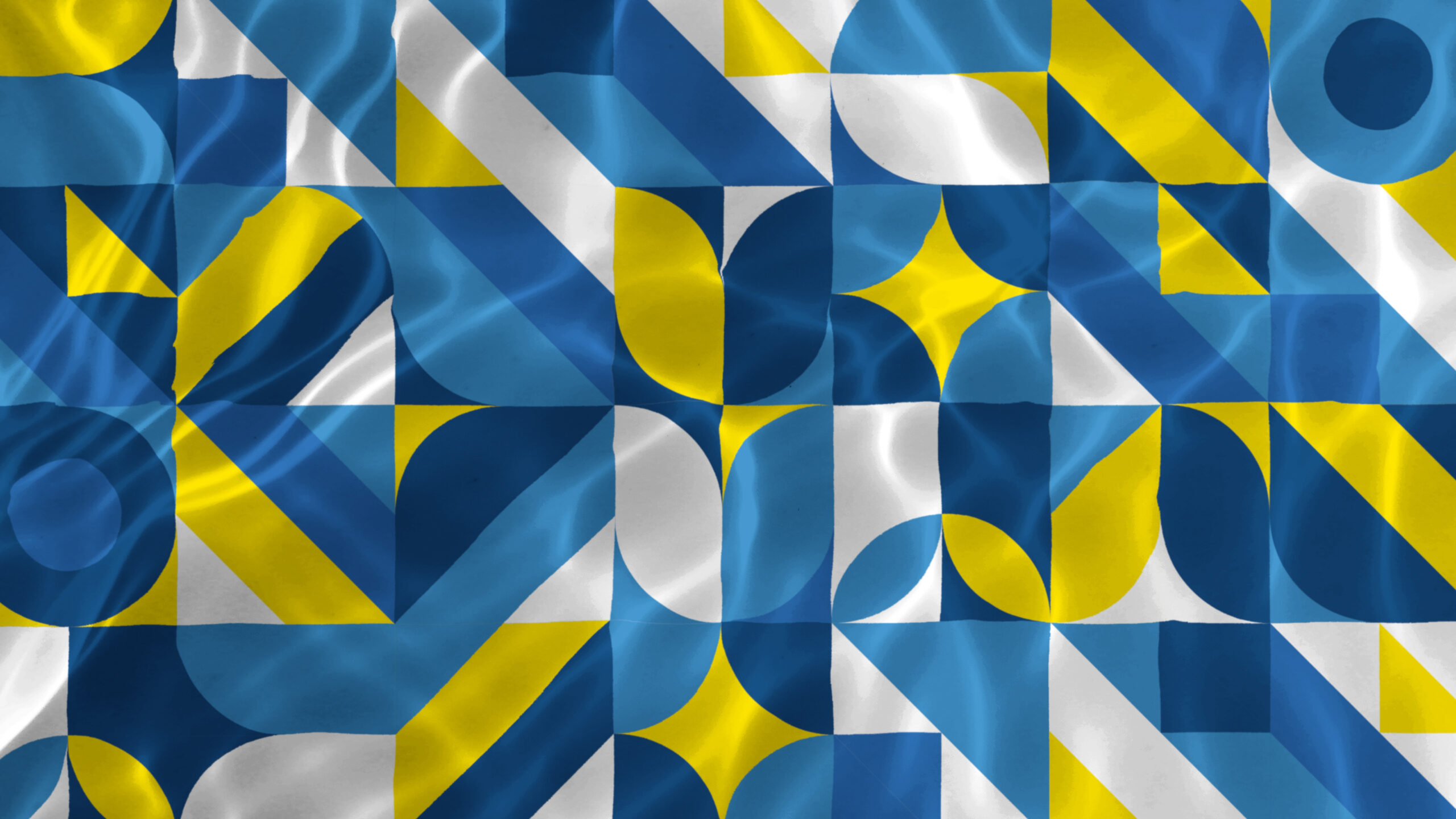
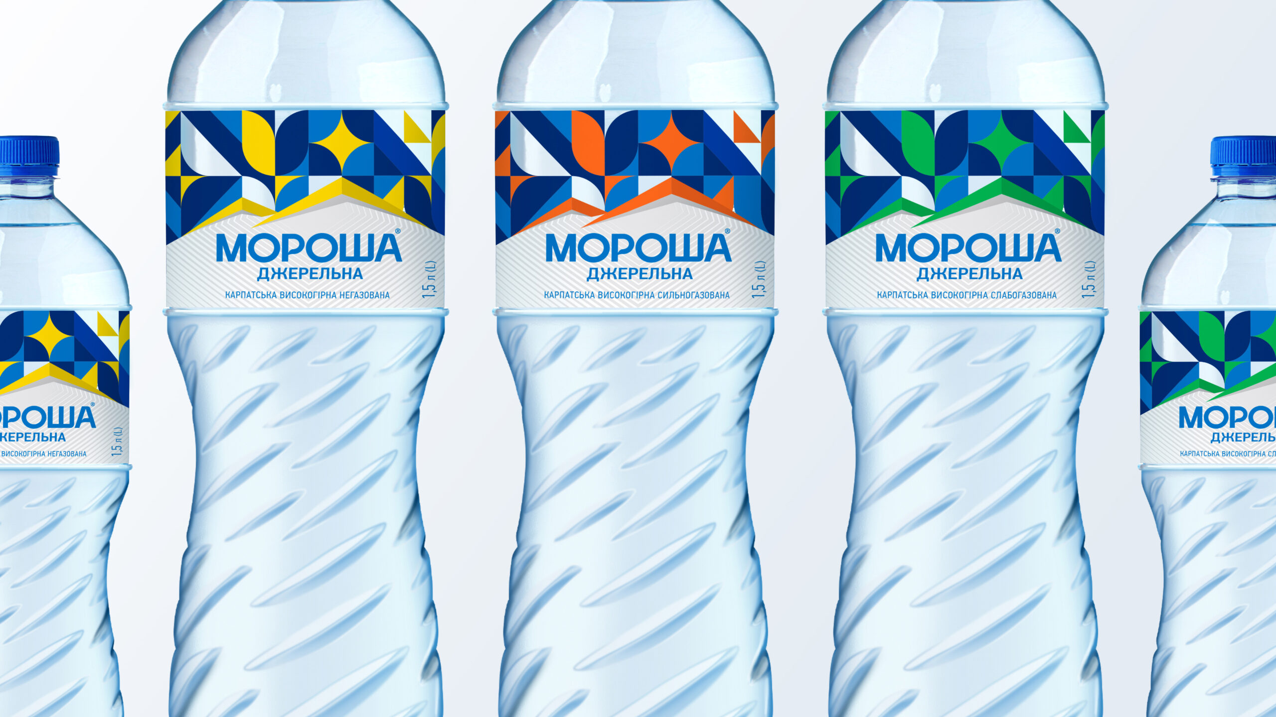
vision of hope. The bold geometric shapes and vibrant colours are
inspired by the Ukrainian flag and traditional ethnic symbols,
reflecting the nation’s rich cultural heritage. The blue evokes
harmony and offers a connection to the Carpathian source of this
life-giving water.
The design reflects
the spirit of the new Ukrainian people. It embodies forward-thinking,
self-reliance, authenticity, and meaning. It stands as an ally—a
quiet and steadfast companion—urging Ukrainians to embrace their
inner hero and rediscover their strength.
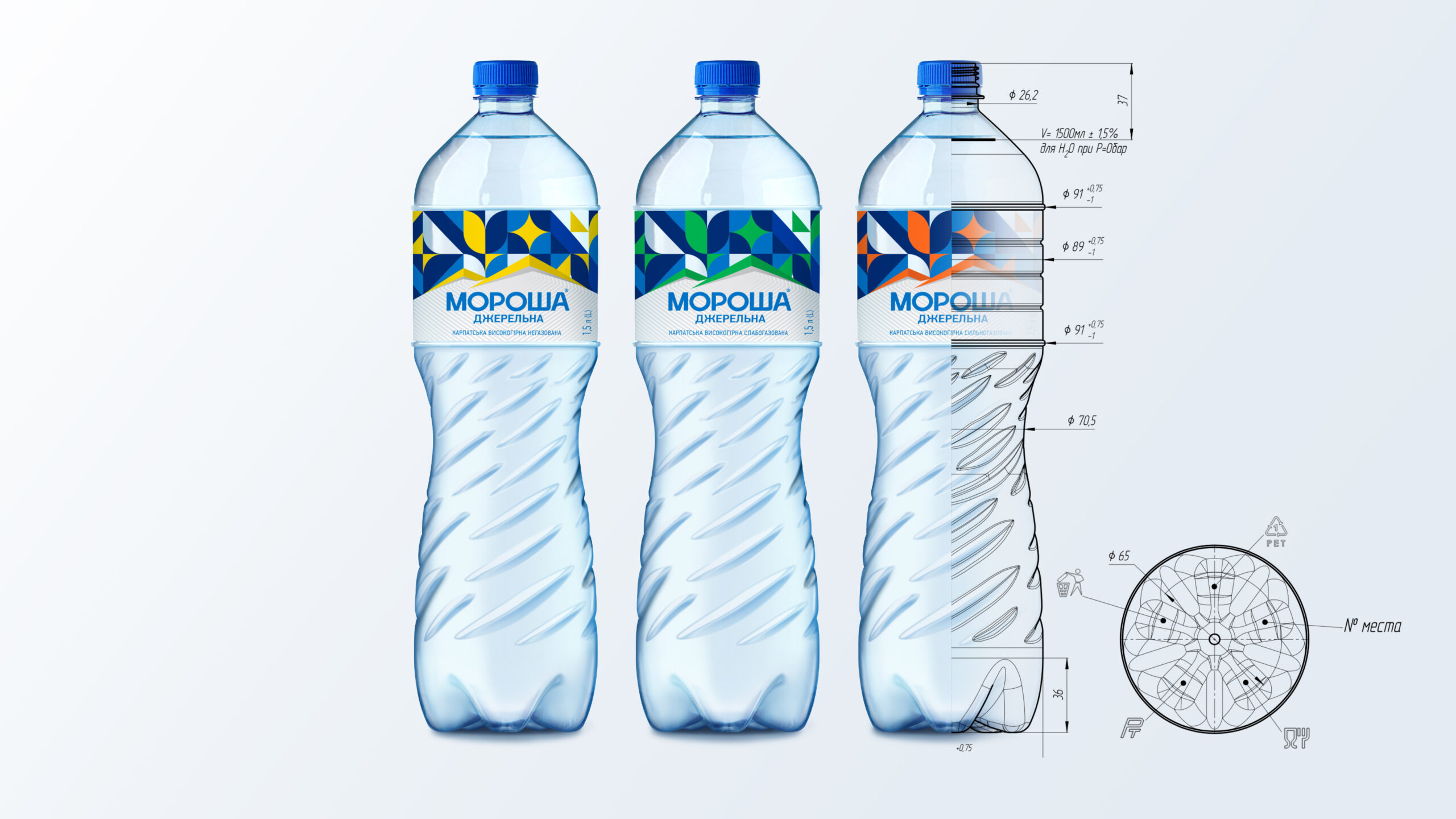
Morosha Dzherelna’s
bottle design—like the water
itself—restores body and soul, whispering a message of perseverance
with every drop. This is more than a refreshment; it is “The
Water of the Next Day,” a testament to Ukraine’s brave soul
and the boundless possibilities of its future.
Brand Architecture, Brand Definition, Brand Development, Brand Growth, Brand Guidelines, Brand Identity, Brand Key Messaging, Brand Story, Brand Strategy, Corporate Identity, Design Strategy, Packaging Design, Tone of Voice, Typography, Visual Identity
Awards & Distinctions
| 2025 | Indigo Design Award | Silver | Branding |
| 2025 | MUSE Awards | Silver | |
| 2025 | DNA Paris Design Awards | ||
| 2025 | C2A | Honorable Mention | Beverage - Packaging |