
DAIS
Manufacturing, Marine Stainless Steel Hardware
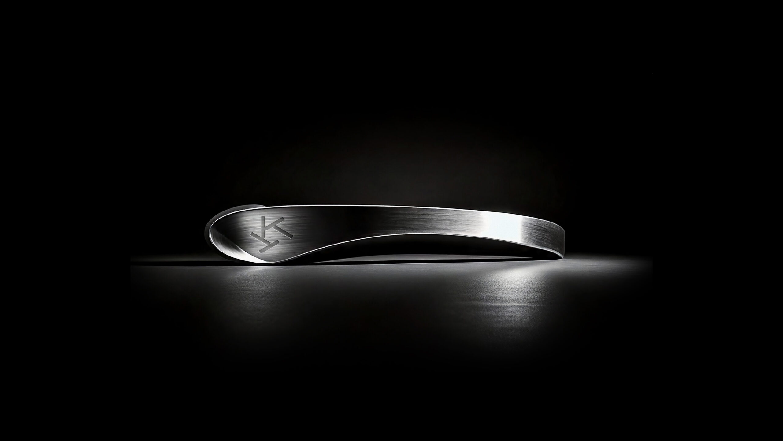
Light, shape, form, motion, reflection, detail.
DAIS brings them to life in steel, crafting equipment for
boats that sail towards open horizons. We transformed them into an
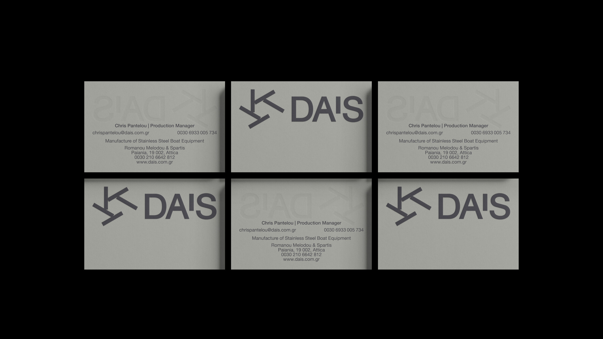
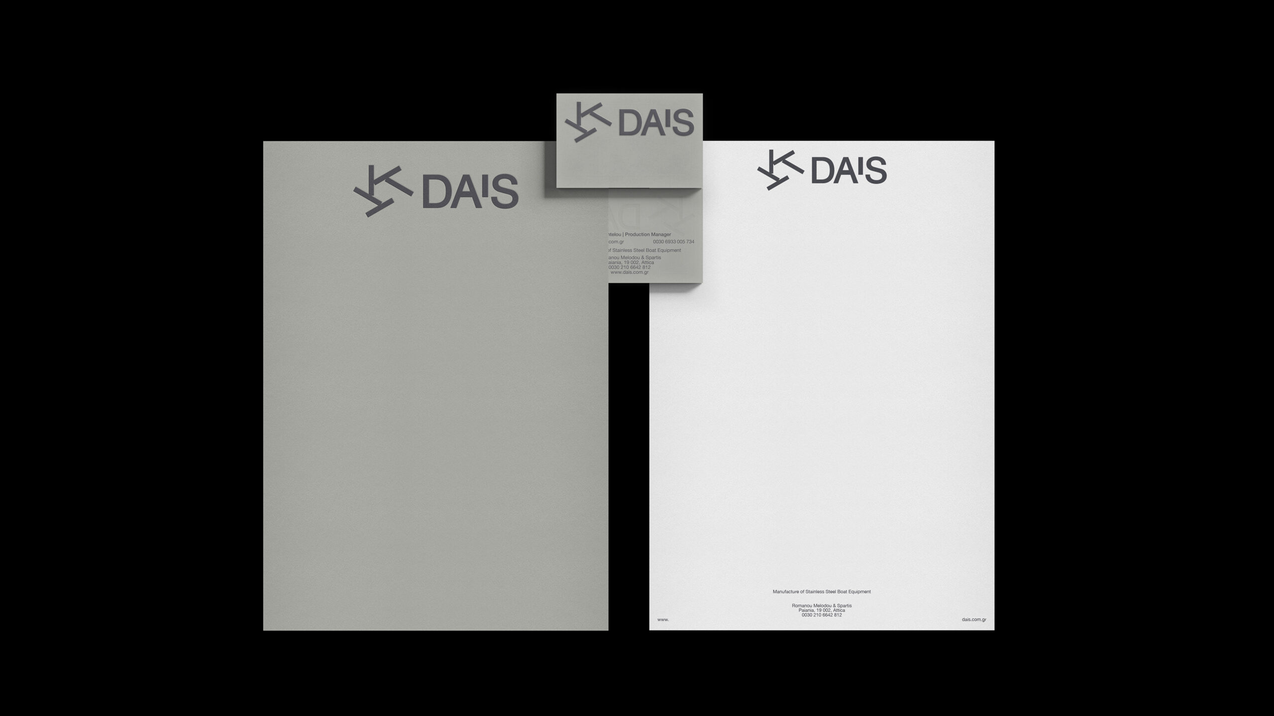
idea by creating a visual identity that embodies the essence of the
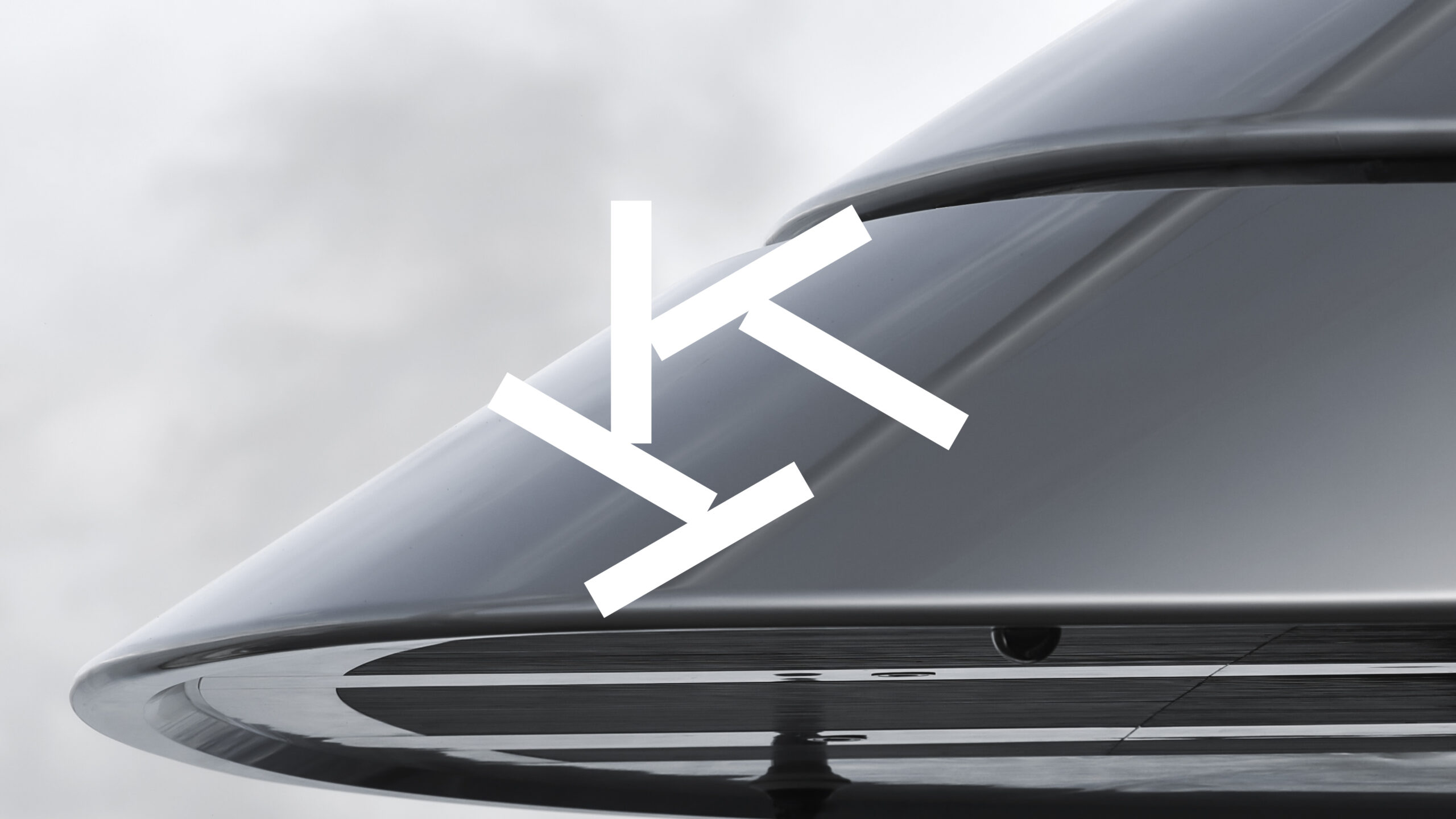
company. Just as the sea reflects the sky, the identity mirrors the
timeless strength and refined elegance of stainless steel. The
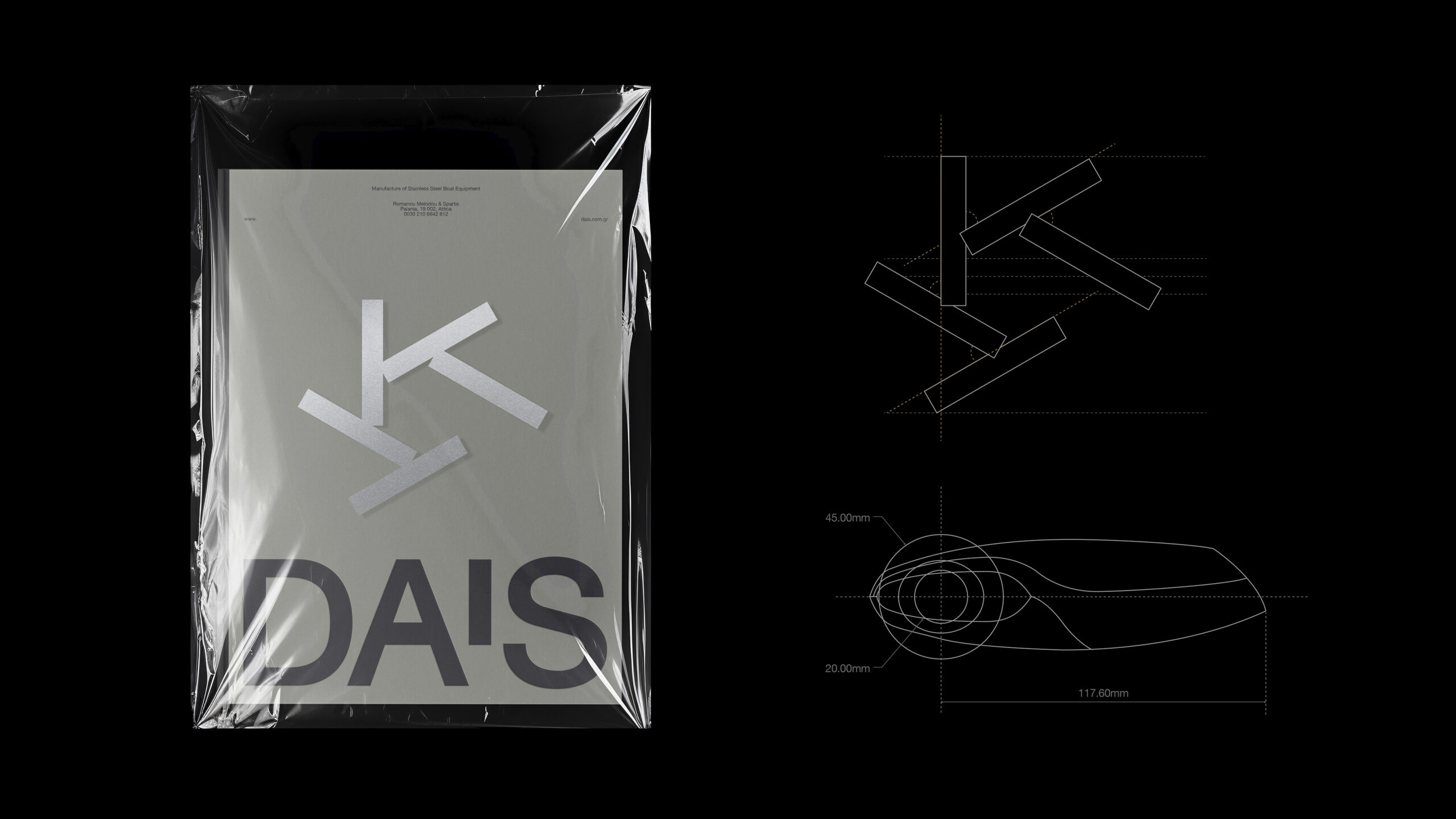
brand’s logo was born from currents meeting in the open sea. It
transcended into a gear, propelling motion across the water. Through
rotation and contrast, it captures the rhythm of waves and the
brilliance of sunlight on polished metal. Harmony within strength.
Elegance within functionality. This is a brand built to withstand the
test of time. Its movement is perpetual. It never ceases to shine and
guide. Its identity tells a story of a journey that begins with the
first cut of steel and sends DAIS sailing towards new destinations,
as every detail, every line, every reflection builds creation,
exploration, and progress.
Brand Definition, Brand Development, Brand Guidelines, Brand Identity, Brand Key Messaging, Brand Strategy, Corporate Identity, Design Strategy, Digital Presence, Illustration Language, Image Language, Naming & Nomeclature Systems, Typography, Visual Identity, Websites
Awards & Distinctions
| 2025 | C2A | Honorable Mention | Corporate Identity - Branding |